Friday, 3 December 2010

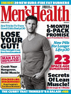
-Men's lifestyle magazine
-Masthead: Men's Health
-Price: £3.99
-House style: Blue, red and white, with black and white central dominant image. These colours compliment each other making the magazine look basic but practical.
-Ad portfolio: mainly health products (protein shakes etc), technology and gadgets as well as many healthcare and grooming products.
-Frequency: Monthly
-Quick history: Launched in 1987 in U.S as a health-oriented service magazine by founding editor Mark Bricklin, Men’s Health has evolved into a lifestyle magazine for men, covering areas such as health, fitness, nutrition, relationships, travel, technology, fashion and finance. The circulation grew to more than 1.5 million in less than two years and spawned over 20 foreign editions. In 1995 the U.K launch of Men's Health monthly maintained sales as men's lifestyle titles such as FHM and Loaded plummeted. In 2004, the UK arm of Rodale formed a 50:50 joint venture with NatMags, NatMags Rodale. In 2007, Men’s Health launched the FitSchools initiative to combat childhood obesity.
- mode of address: the mode of address is intellectual and like a personal trainer is teaching as well as a friend talking to you about health, relationships and style. It is, as the puff suggests, high quality and has diverse vocabulary, but does not appeal to all men.

Thursday, 2 December 2010

Mood board


This is the mood board I have created to base my magazine off. The title is in the middle of the images. Each image represents what I feel my target readership eat, watch, listen to, aspire to and wear. This board will help decide the of mode of address and the articles I will include in my magazine. Also, the images will help me decide what the cover will look like.

Quick analysis - 1 (NME)

- Mainly alternative, rock and some pop (mainly from the past)
- Owner :Maurice Kinn up until 1963 then it was taken over by IPC from 1963 until present day.
- Masthead :NME
- Price: £2.30
- House style: For this issue the background is light blue because it is one of the colours furthest from human skin meaning the central dominant image is crisp and defined. There is also white to add the light feeling conveyed by the cover.
-Advert portfolio: Mainly music gigs and new albums but also includes alcohol with a musical theme, as well as some video games.
-Frequency: Weekly
Quick history: The paper's first issue was published on 7 March 1952 after the Musical Express and Accordion Weekly was bought by London music promoter Maurice Kinn, and relaunched as the New Musical Express. It was initially published in a non-glossy tabloid format on standard newsprint.
- Font size and style: It is rounded and is arranged to show off the usp of the magazine being My Chemical Romance rather well as well as making it eye-catching.
- Mode of address: the text is quite intellectual and full of facts. It is sarcastic, this ties to the aspect of the magazine being 'cool' and makes fun of things they do not like but promote what they like, heavily. The articles of people reviewing gigs are very helpful to people who enjoy that bands music, also, they use many music references and joke with some of the bands that the magazine features more often.

Wednesday, 1 December 2010

Hello, my name is Jamie.

I am interested in most types of music, this is reflected in my magazine which is to be called 'Music Now'.

It is based on music in the UK charts. This will include many different genres of music and artist profiles along with reviews. The target audience will be lovers of music in multiple genres aged 16 - 25. There are 2 competitors, however I believe my magazine can beat them.

Music Now will be weekly, every Monday, and will cost £2.50.

Thursday, 25 November 2010

Pre - lim task

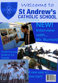
This is a scanned image of my front cover. The magazine is dominantly blue because it ties in with the school colours.

The audience it is aimed at year 7 - 9 (ages 11- 14). This is why there are plenty of pictures that are at an angle and large writing to attract their attention to the articles.

The main article is about Mr. Burton. This is because most of the students will get to know him. The article is an interview with him about his teaching career etc. This is why it is at the top of the cover. This article would be a fortnightly to match the frequency of the magazine.

The other images are of the years the magazine is aimed at. They are of a range activities at the school as I wanted to convey the whole school through the magazine. This is also shown by the guide to the month. This is to help promote the school events, exams and would inform people in the schools local area of any events open to the public like fairs.

The price is affordable so people in age range can buy it, but also, in the future editions other features would be included such as 'have your say' and competitions this would make the target audience want to buy it as it is in their interests and gives them a chance to interact with the magazine.